
This section describes the widgets in the ABAQUS GUI Toolkit that allow the user to input text. The following topics are covered:
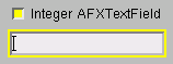
The AFXTextField widget provides a single line text entry field. AFXTextField extends the capability of the standard FXTextField widget with the following:
An optional label.
Support for a toggled version and a read-only state.
An additional numeric type (complex).
Horizontal and vertical layouts.
AFXTextField(parent, 8, 'String AFXTextField')
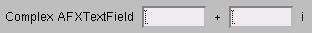
Text fields are generally connected to keywords, and the type of the keyword determines the type of input allowed in the text field. For example, if the text field is connected to an integer keyword, the keyword will verify that the input in the text field is a valid integer. You do not need to specifiy any option flags for the text field to get this behavior. Complex text fields are an exception to this—to display the extra field needed to collect complex input, you must specify the bit flag shown in the following example:
AFXTextField(parent, 8, 'Complex AFXTextField',
None, 0, AFXTEXTFIELD_COMPLEX)Toggled variation
In many cases a check button precedes a labeled text field. The check button allows the user to toggle the component on or off; when the component is toggled off, the text field becomes disabled. The AFXTextField widget creates a check button with this behavior when you supply the AFXTEXTFIELD_CHECKBUTTON flag. The following example creates a check button with a text field. It also configures the widget in a vertical orientation so that the label is above the text field.
AFXTextField(parent, 8, 'AFXTextField', None, 0,
AFXTEXTFIELD_CHECKBUTTON|AFXTEXTFIELD_VERTICAL)Non-editable variation
In some cases you may want to change the behavior of a text field so that it cannot be edited by the user; for example, when a particular check button in the dialog box is not set. In this case, you can make the text field non-editable when the check button is unset by calling the setEditable(FALSE) method of the AFXTextField widget.
Read-only variation
In some cases you may want to change the behavior of a text field so that it cannot be edited by the user and appears as a label, making it clear that the user cannot change its contents. For example, when you are using the Load module in ABAQUS/CAE, there are some values that you can specify in the analysis step in which the load was created but you cannot change in subsequent steps. The AFXTextField widget supports a read-only state through the setReadOnlyState method. For example,
tf = AFXTextField(parent, 8,
    'String AFXTextField in read-only mode:', keyword)
tf.setReadOnlyState(TRUE)