
This section describes the widgets in the ABAQUS GUI Toolkit that use labels and buttons. The following topics are covered:
Several widgets in the ABAQUS GUI Toolkit support labels. If you want to put a label before a text field, for example, you should use AFXTextField instead of creating a horizontal frame and adding a label widget and a text field widget. The following sections describe the specific widgets that support labels.
The label and button constructors all take a text string argument. This text string can consist of three parts, where each part is separated by \t. The three parts of the text string are
Text
The text displayed by the widget.
Tip text
The text displayed when the cursor is held over the widget for a short period of time. If there is only an icon associated with a widget, you must supply the tip text.
Help text
The text displayed in the application's status bar, assuming that the application has a status bar.
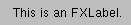
The FXLabel widget displays a read-only string. FXLabel can also display an optional icon.
FXLabel(parent, 'This is an FXLabel.\tThis is\nthe tooltip')
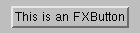
The FXButton widget contains a label and/or an icon. When the user clicks the button, an immediate action is invoked.
FXButton(parent, 'This is an FXButton')
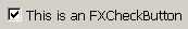
The FXCheckButton widget provides an “On/Off” toggling capability. The button also supports a third “Maybe” or “Some” state. The “Maybe” state is often used to represent a partial selection; for example, the AFXOptionTreeList widget makes use of the “Maybe” state. You can set the “Maybe” state only programmatically; the user cannot toggle the button to this state.
FXCheckButton(parent, 'This is an FXCheckButton')
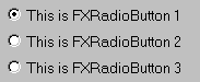
The FXRadioButton widget provides a one-of-many selection from a group of buttons.
FXRadioButton(parent, 'This is FXRadioButton 1')
FXRadioButton(parent, 'This is FXRadioButton 2')
FXRadioButton(parent, 'This is FXRadioButton 3')
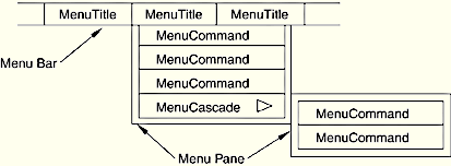
A menu consists of the following:
A menu title created by AFXMenuTitle.
A menu pane created by AFXMenuPane.
A menu command created by AFXMenuCommand.
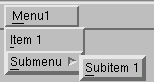
The following example illustrates the use of cascading menus:
menu = AFXMenuPane(self)
AFXMenuTitle(self, '&Menu1', None, menu)
AFXMenuCommand(self, menu, '&Item 1', None, form1,
    AFXMode.ID_ACTIVATE)

subMenu = AFXMenuPane(self)
AFXMenuCascade(self, menu, '&Submenu', None, subMenu)
AFXMenuCommand(self, subMenu, '&Subitem 1', None,
form2, AFXMode.ID_ACTIVATE)In addition to specifying a mnemonic using the & syntax described in “Labels and buttons,” Section 3.1, you can specify an accelerator in the menu item's label. You specify an accelerator by separating it from the button's text by a \t. For example,
AFXMenuCommand(self, menu,
    'Graphics Options...\tCtrl+G', None,
GraphicsOptionsForm(self), AFXMode.ID_ACTIVATE)You can create a popup menu that appears when the user clicks mouse button 3 over a widget. For example, the following statements illustrate how you can create a popup menu that contains two buttons that appear when the user clicks mouse button 3 over a tree widget:
# In the dialog box constructor:

    def __init__(self, form):

        ...
        FXMAPFUNC(self, SEL_RIGHTBUTTONPRESS, self.ID_TREE,
            MyDB.onCmdPopup)
        FXMAPFUNC(self, SEL_COMMAND, self.ID_TEST1,
            MyDB.onCmdTest1)
        FXMAPFUNC(self, SEL_COMMAND, self.ID_TEST2,
            MyDB.onCmdTest2)

        self.menuPane = None

        FXTreeList(self, 5, self, self.ID_TREE,
            LAYOUT_FILL_X|LAYOUT_FILL_Y|\
            TREELIST_SHOWS_BOXES|TREELIST_SHOWS_LINES|\
            TREELIST_ROOT_BOXES|TREELIST_BROWSESELECT)
        ...

    def onCmdPopup(self, sender, sel, ptr):

        if not self.menuPane:
            self.menuPane = FXMenuPane(self)
            FXMenuCommand(self.menuPane, 'Test1', None, self,
                self.ID_TEST1)
            FXMenuCommand(self.menuPane, 'Test2', None, self,
                self.ID_TEST2)
            self.menuPane.create()

        status, x, y, buttons = self.getCursorPosition()
        x, y = self.translateCoordinatesTo( self.getRoot(), x, y )
        self.menuPane.popup (None, x, y)

        return 1
Note: The AFXTable has its own popup menu commands that you should use in place of the approach described in this section.
The AFXToolButton widget displays no text in its button, but the button generally has a tool tip. You group the buttons created by AFXToolButton into toolbars using AFXToolbarGroups or into toolboxes using AFXToolboxGroups. AFXToolbarGroups and AFXToolboxGroups provide visual grouping between buttons in the toolbar or toolbox. For example,
# Create toolbar icons
#
group = AFXToolbarGroup(self)
AFXToolButton(group, '\tMy Module\nToolbar Button',
    icon, sel)

# Create toolbox icons
#
group = AFXToolboxGroup(self)
AFXToolButton(group, '\tMy Module\nToolbox Button',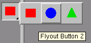
icon, sel)The AFXFlyoutButton widget displays a flyout popup window. The flyout popup window contains AFXFlyoutItem widgets and appears when the user presses mouse button 1 on the button and holds down mouse button 1 for a certain time span. If the user simply clicks mouse button 1 quickly on the button, the flyout popup window will not be displayed, and the flyout button will act just like a regular button. The AFXFlyoutButton widget displays the icon of the current target along with a right triangle in the lower right corner to indicate that a flyout popup window can be invoked. For example,
group = AFXToolbarGroup(self)
popup = AFXPopup(self, getAFXApp().getAFXMainWindow())
AFXFlyoutItem(popup, '\tFlyout Button 1', squareIcon)
AFXFlyoutItem(popup, '\tFlyout Button 2', circleIcon)
AFXFlyoutItem(popup, '\tFlyout Button 3', triangleIcon)
AFXFlyoutButton(group, popup)
popup.create()