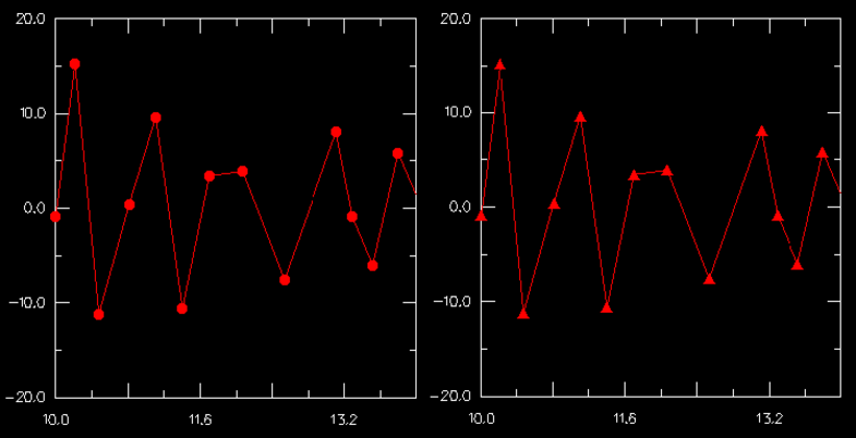
Use the XY Curve Options dialog box to customize the appearance of the symbol used to represent data points on an X–Y curve. For example, in Figure 29–39 the plot on the left uses the default symbols, while the plot on the right uses customized symbols.
The symbol that you select appears along the curve and in the legend. The customization options are available only when Show symbol is toggled on.
To customize the symbols used on an X–Y curve:
Locate the XY Curve Options dialog box.
From the main menu bar, select Options![]() XY Curve; the XY Curve Options dialog box appears.
XY Curve; the XY Curve Options dialog box appears.
From the XY Data field, select one or more X–Y curves whose symbols you wish to customize.
Note: To make an X–Y data object available for selection, you must first plot it.
Toggle Show symbol to display or suppress the symbols representing each selected X–Y curve's data points.
When Show symbol is on, symbols are displayed and the symbol attributes are enabled.
Choose the symbol:
Click the Symbol button to reveal the choice of symbols.
From the list of symbols, click the desired symbol.
The specified symbol appears on the Symbol button.
Choose the symbol color:
Click the color sample ![]() .
.
ABAQUS/CAE displays the Select Color dialog box.
Use one of the methods in the Select Color dialog box to select a new color. For more information, see “Customizing colors,” Section 3.2.9.
Click OK to close the Select Color dialog box.
The color sample changes to the selected color. The new color does not appear in the viewport until you click OK or Apply in the XY Plot Options dialog box.
Choose the symbol size:
Click the Size button to reveal the symbol size options.
From the symbol size options, click the desired symbol size.
The specified symbol size appears on the Size button.
Select the frequency of the symbols.
Type an integer into the Frequency text field to choose how often symbols appear along the curve. For example, if you enter a frequency of two, ABAQUS displays symbols at every second data point. The value zero is not allowed; to suppress the display of symbols, toggle off Show symbol.
Click Apply to implement your changes.
Along each selected curve and in the legend, the symbol representing the selected X–Y data points changes to reflect your specifications. For more information on the legend, see “Customizing the legend,” Section 37.1.
Your changes are saved for the duration of the session and will affect all subsequent X–Y plots of this data.