
The AFXModuleGui base class provides various module infrastructure support functions. For example, the AFXModuleGui base class keeps track of the module’s menus, along with its toolbar and toolbox icons. As a result, the menus, toolbars, and icons can be swapped in and out automatically as the user changes modules.
The following example shows how to create a module GUI; subsequent sections explain the details of this example.
from abaqusGui import *
from myModes import mode_1, mode_2, mode_3
from myIcons import *
from myToolsetGui import MyToolsetGui

class MyModuleGui(AFXModuleGui):
    #~~~~~~~~~~~~~~~~~~~~~~~~~~~~~~~~~~~~~~~~~~~~~~~~~~~~~~~~~~~
    def __init__(self):

        # Construct the base class
        #
        AFXModuleGui.__init__(self, moduleName='My Module',
            displayTypes=PART)

        # Menu items
        #
        menu = AFXMenuPane(self)
        AFXMenuTitle(self, '&Menu1', None, menu)
        AFXMenuCommand(self, menu, '&Item 1', None, mode_1,
            AFXMode.ID_ACTIVATE)

        subMenu = AFXMenuPane(self)
        AFXMenuCascade(self, menu, '&Submenu', None, subMenu)
        AFXMenuCommand(self, subMenu, '&Subitem 1', None, mode_2,
            AFXMode.ID_ACTIVATE)

        # Toolbar items
        #
        group = AFXToolbarGroup(self)
        icon = FXXpmIcon(getAFXApp(), iconData1)
        AFXToolButton(group, '\tTool Tip', icon, mode_1,
            AFXMode.ID_ACTIVATE)

        # Toolbox items
        #
        group = AFXToolboxGroup(self)
        icon = FXXPMIcon(getAFXApp(), iconData2)
        AFXToolButton(group, '\tTool Tip’, icon, mode_1,
            AFXMode.ID_ACTIVATE)

        popup = AFXPopup(self, getAFXApp().getAFXMainWindow())
        AFXFlyoutItem(popup, '\tFlyout Button 1', squareIcon,
            mode_1, AFXMode.ID_ACTIVATE)
        AFXFlyoutItem(popup, '\tFlyout Button 2', circleIcon,
            mode_2, AFXMode.ID_ACTIVATE)
        AFXFlyoutItem(popup, '\tFlyout Button 3', triangleIcon,
            mode_3, AFXMode.ID_ACTIVATE)
        AFXFlyoutButton(group, popup)

        # Register toolsets
        #
        self.registerToolset(MyToolsetGui(),
            GUI_IN_MENUBAR|GUI_IN_TOOL_PANE)

    #~~~~~~~~~~~~~~~~~~~~~~~~~~~~~~~~~~~~~~~~~~~~~~~~~~~~~~~~~~~
    def getKernelInitializationCommand(self):
        return 'import myModule'

# Instantiate the module
#
MyModuleGui()To create your own module GUI, you begin by deriving a new class from the AFXModuleGui base class. Alternatively, if there is another module GUI class that provides most of the functionality that you want, you can begin by deriving from that class and then make modifications. For more information, see Chapter 10, “Customizing an existing module or toolset.”
Inside the new class constructor body, you must call the base class constructor and pass self as the first argument. The moduleName is a string used by the GUI infrastructure to identify this module. displayTypes are the flag or flags that specify the type of object that is being displayed in this module. Possible values are PART, ASSEMBLY, ODB, XY_PLOT, and SKETCH. If you specify ASSEMBLY, your module must import the assembly kernel module because the assembly kernel module is required to initialize some assembly display options. For more information, see “Kernel module initialization,” Section 8.2.6.
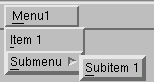
Menu bar items consist of a menu title that controls a menu pane. The menu pane, in turn, contains menu commands. Menu commands are buttons that invoke modes.
The example in “GUI module example,” Section 8.2, creates a top-level menu pane that contains a submenu. The menu commands in the submenu specify the mode that the menu command will invoke by sending the mode an activate message. For more information, see “Mode processing,” Section 7.2. Figure 8–1 shows the menus and submenus created by the example.
Toolbar items are displayed across the top of the main window under the menu bar and consist of a button that contains an icon. Toolbar items are placed in a group that is shown only when its module or toolset is current. The group also contains a separator that provides a visual distinction from the other groups of icons in the toolbar.
The example in “GUI module example,” Section 8.2, creates a toolbar group and adds a button to the toolbar. The new button invokes the same mode that will be invoked by the first menu item in the example. For more information, see “Mode processing,” Section 7.2.
Toolbox items are displayed along the left edge of the main window and consist of a button that contains an icon. As with toolbar items, toolbox items are placed in a group that is shown only when its module or toolset is current. Similarly, toolbox groups are spaced apart to provide a visual distinction from the other groups of icons in the toolbox.
The example in “GUI module example,” Section 8.2, creates a toolbox group and adds a button to the toolbox. The new button invokes the same mode as the first menu item in the example.
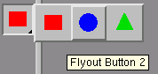
Toolboxes can also contain flyout menus. When the user presses mouse button 1 on the flyout button and holds it down for a certain time span, a flyout button displays a popup window containing buttons. If the user just quickly clicks mouse button 1 on the flyout button, the flyout popup is not displayed and the flyout button acts as a regular button. A flyout button displays an icon for the current function along with a triangle in the lower right corner. Figure 8–2 shows the flyout buttons created by the example.
Modules can include toolsets simply by registering them. Toolsets that are registered with a module will be available when that module is the current module. To register a toolset, you supply a pointer to the toolset along with bit flags that specify where in the GUI the toolset has defined components. The following locations are supported:
| FLAG | LOCATION IN GUI |
|---|---|
| GUI_IN_NONE | Toolset has no components in standard locations. |
| GUI_IN_MENUBAR | Toolset has components in the menu bar. |
| GUI_IN_TOOL_PANE | Toolset has components in the Tools menu pull down pane. |
| GUI_IN_TOOLBAR | Toolset has components in the toolbar. |
| GUI_IN_TOOLBOX | Toolset has components in the toolbox. |
If you do not specify a flag in an area in which you have created some GUI components, those components will not be shown in the application.
In general, a GUI module is designed to provide an interface to a kernel module. After the GUI collects input from the user, it constructs a command string that is sent to the kernel for processing. For the command to be recognized on the kernel side, the appropriate kernel module must have been imported before the command was sent.
When a GUI module is loaded for the first time, a special method named getKernelInitializationCommand is executed. This method is empty in the base class implementation, and it is up to you to write a method that returns the proper command that will import the appropriate modules on the kernel side. The appropriate modules include any module for which your GUI module can issue commands. If more than one module is required, you can separate the statements by semi-colons or “\n” characters. To avoid name space conflicts with modules loaded by ABAQUS, you should use the import moduleName style for importing modules and not the from moduleName import * style, as shown in the example in “GUI module example,” Section 8.2.