| Huy Do, huy.do (at) wustl.edu (A paper written under the guidance of Prof. Raj Jain) |
Download |
Performance visualization is a useful tool to represent and analyze the performance data collected from a computer system. In this paper, we introduced a survey of the most recent researches related to performance visualization using our own classification scheme. We presented some background information to justify that scheme as well as to motivate the summary of each research. When summarizing each research, we highlighted its unique contribution in terms of data collection or visual presentation technique.
Keywords: performance visualization, data representation, performance analysis, visualization tools, visualization techniques, computer systems, software systems, high performance computing systems
Performance visualization is an interesting area of research that encompasses both science and arts. Its goal is to help humans not only gain an intuitive understanding of a computer system through visual means, but also debug and optimize that system. In recent years, the growing complexity and size of computer systems creates the demand for new techniques and tools to visualize their performance. These include both advances in techniques used to collect the data about the system, as well as the visual methods to present that data.
In this paper, we did a survey of those techniques and tools. Performance visualization is a broad field, where research is tailored to the system of interest (for example different types of software, hardware and large-scale distributed system). Within each type of system, the tools also differ due to the types of data that they are representing and the goal of the performance analysis. Thus, our survey would attempt to give an overview of the current research trends without going into too much details about the individual research. However, we would highlight each research's unique contribution to either data collection or visual presentation techniques.
For a performance visualization survey, one of the challenges is to categorize the researches in a logical manner. Some surveys attempted to categorize them by the context of performance analysis [Isaacs14] (i.e. whether one is analyzing software/ hardware or other types of systems), some by the type of data represented (such as temporal, spatial, ..) and some by the visual presentation of the tool [Gao11] (such as 2D graphs, tree-nodes, ..). In our survey, we would first categorize the research into the nature of the data being presented (temporal or structural), and within each category we classified it further according to the context of performance analysis (software or distributed system). Section 2 will provide the background information on the types of systems and performance data, while section 3 and 4 will present the research trends based on the proposed classification.
The first type of system explored in this survey are software systems. These range from simple computer programs running on personal computer to more complex multi-threaded parallel programs. Performance data of this system usually includes execution time of function calls, memory utilization, and the call stack of different functions in the program. The mechanisms to monitor that data are usually trap instruction, trace mode or timer interrupt [Jain91] . The goals of performance visualization for this system are usually code debugging, memory management and bottlenecks identification.
The second type of system and the one attracting the most research interests are large-scale distributed systems, involving both software and hardware components running many jobs in parallel. Examples of these systems are high performance computing (HPC) systems, networks and databases. Common performance data of HPC systems are jobs activity and their resource consumption, as well as the behavior of messages being passed between parallel tasks. Since these systems are so complex and involve both software and hardware components, the goal of performance visualization is to gain a better high level understanding of the whole system. However, some tools also incorporate lower-level details of the system as well. Thus the visualizations can greatly help with system debugging and optimization.
The third type of system traditionally analyzed through visualization are hardware systems. However, we were unable to find research in the last five years dedicated to visualizing pure hardware systems. This is because modern system tends to have a layer of abstraction on top of the lower hardware layer. Most analysis is then performed on this abstracted layer.
Data can be classified in various ways, such as between qualitative and quantitative variables [Jain91], or by the number of dimensions of the dataset. In the scope of our survey, we decided to categorize the data into two types: temporal and structural.
Temporal data will include quantitative variables obtained through tracing, i.e. the logging of events with timestamps and related parameters. When presenting temporal data, the visualization tool will always have the time dimension.
On the other hand, structural data are usually qualitative variables extracted from tracing and profiling the system. The plots of structural data will not contain a time dimension, and usually present the connection between nodes in a network, or functions in a software.
Visualization of temporal data is very useful when developers analyze a system during runtime. The developers can pinpoint exactly the point in time when something goes wrong, as well as explore the sequence of execution of tasks and optimize the system runtime.
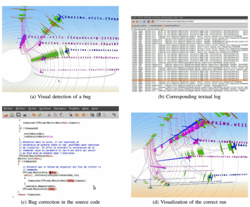
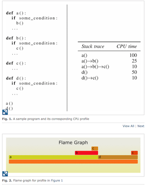
Temporal data in software systems are usually gathered from tracing. Visual inspection of this data help developers debug and improve the software runtime. [DeVaux14] presented a 3D tubular visualization to present log data in multi-threaded software (Figure 1). [Bezemer15] presented a technique to compare the performance difference in time between 2 softwares using differential flame graphs. Flame graphs (Figure 2) are useful in showing hierarchical data, where the horizontal axis is time and the vertical axis depicts the order of execution in a stack trace. However, this technique doesn't scale for software with large trace logs.
For systems with larger trace logs, [Ezzati-Jivan14] created an interactive tool that first categorize the events in a trace log into alerts, faults, synthetic events, system calls and kernel events. Then the tool allows users to zoom on a timeline view to inspect the events that they are interested in. To achieve the same goal of visualizing large trace logs, [Dosimont14] instead used spatiotemporal data aggregation technique to merge homogeneous trace areas on the Gantt chart. This helps user gain a better high-level understanding of the software.
When observing the evolution of a distributed system as a function of time, developers usually pay attention to the scheduling of tasks/processes/jobs and the communication between those while they are executing in parallel. [DePauw13] visualized the activity of jobs using shared resources in a distributed environment using 2D graph, with the job trace moving up and down on the vertical axis based on its resource consumption over time. This tool helps developers tweak the system to maximize resource utilization. [Haugen15] presents a trace visualization method for parallel systems that use task-based scheduling, where the scheduling library automatically makes decision on when and where to execute tasks making it difficult for developers to follow. Aftermath [Drebes14] is another tool to visualize trace in parallel system, which supports display of multiple performance metrics, as well as filtering mechanisms.
For large scale software systems, recording the trace log may require gigabytes to terabytes of data which takes time and memory. To address this problem, [Adhianto16] used a client-server approach to offload the computation and storage burden to a server. This technique is proven to be very effective, given that the network connection between the client and server is reliable.
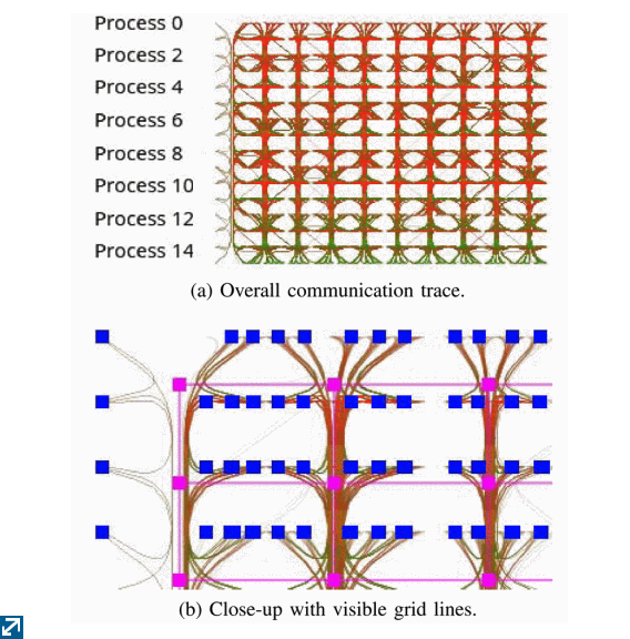
In parallel software systems that employ the Message Passing Interface (MPI) to send messages between parallel processes, there's a need to visualize these messages over time. Traditional techniques such as drawing a line between two processes on a Gantt chart when a message is passed between them can quickly cause cluttering when there are a large number of messages sent at the same time. [Brendel16] used edge-bundling to group these messages together as well as additive color mixing to highlight the active regions. (Figure 3)
Compared to temporal data, analysis of structural data is usually done either during the system development process (before runtime) or after a system run. Developers use structural data to gain a high-level understanding of the system. Some common visualization goals are identifying the connection between various threads within a software or parallel jobs within a distributed system.
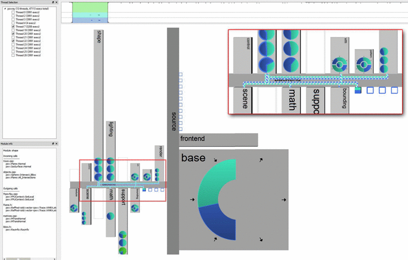
Being able to understand software system at a high level can help developers improve the hierarchical structure of the code base (which usually includes various packages, classes and methods). Some tools used very creative approach to visualize a software structure. Stepping away from the traditional tree-based plots, ThreadCity [Hahn15] employed a street map layout to visualize software, where each "building" represented a class in the package, and the "streets" are connected based on the hierarchy in the software package (Figure 4). Designed for multi-threaded software, ThreadCity combined the city map with a pie chart within each building or street that displays the rate of each thread for 3 types of calls: incoming, outgoing and internal calls.
For software programmers to optimize their code, [Beck13] proposed a plug-in for software integrated environment development (IDE) that displays small diagrams next to the method declaration and method calls within the source code view. These diagrams help programmers quickly determine the method runtime as well as the interaction between the threads in a parallel program.
For large-scale distributed and parallel system, a visualization of its high-level structure is desirable because temporal data is difficult to keep track of due to the large number of activities being executed and completed in a very short amount of time. Due to the size of the data recorded from the system, most of the research in this area focus on techniques to categorize and condense big datasets into representable chunks for the visualization tool. The data are usually extracted from the trace logs or through profiling before being processed by the visualization tool. The bundling of activities that have similar characteristics is a popular technique to analyze large scale parallel systems. [Muelder16] proposed grouping compute nodes on Cloud Computing systems based on their similarity in order to quickly detect anomalies. Torus network, a type of supercomputing network poses challenges to visualization because of their high dimensionality. [Cheng14] provided a visual interface that use graph numbering to unravel a 5D torus network into a single string of nodes for more intuitive visualization.
In addition to common activities such as process execution and message communication, large scale systems also have other properties that users want to visualize. [Cottam15] proposed a tool that visualize queueing activity at the worker thread level and parcel activity. Since these systems are so complex, there are many features and details that users often want to investigate. The tool TARBARNAC [Beniamine15] focuses on visualizing the behavior at a hardware level of parallel architecture, in particular the memory access behavior at each thread and each structure.
While giving developers a better high-level understanding of large scale system is desirable, some tools also allow user to examine the system at a more granular level. [Brown15] developed a lightweight profiler to aggregate low-level communication metrics, which are then visualized by mapping to the physical nodes and links in the network instead of the high-level software processes presented by [Brendel16].
Aside from HPC systems, large databases are also a target for performance visualization. To meet the need to process massive datasets in real time, companies started using data stream management systems (DSMS) instead of the traditional static database. To assist users in understanding the behavior of a query into a DSMS, StreamTrace [Battle16] used workflows and timeline diagrams to show how the DSMS operators manipulate the data streams and how they are related within the query.
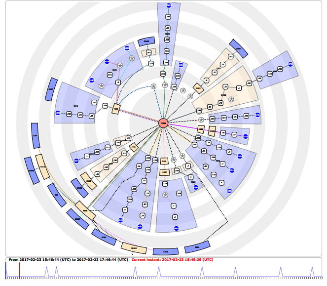
The internet is one of the most complex distributed systems. Internet Service Providers use various tools to monitor the performance of the network. [Candela17] presented Radian, a tool that visualize trace route and other networking measurements as a radial drawing. (Figure 5)
Our survey provided an overview of recent research trends in performance visualization. We also introduced a classification scheme tailored to the list of references we managed to gather. In terms of the type of system. large-scale distributed system attracted the most attention due to its complexity and prevalence in most computer systems. The researches introduced new techniques in data collection, where new methods to collect the data and new types of parameters to be collected are explored. Moreover, the tools also made use of modern graphics to create visually appealing and user-friendly interactive interfaces. Current trends show that this is an ongoing area of research, with many interesting directions to explore.
| HPC | High Performance Computing | |
| IDE | Integrated Environment Development | |
| DSMS | Data Stream Management Systems |