Assignment 4: Electoral Map
Based on material from Alex Lex, University of Utah

Description
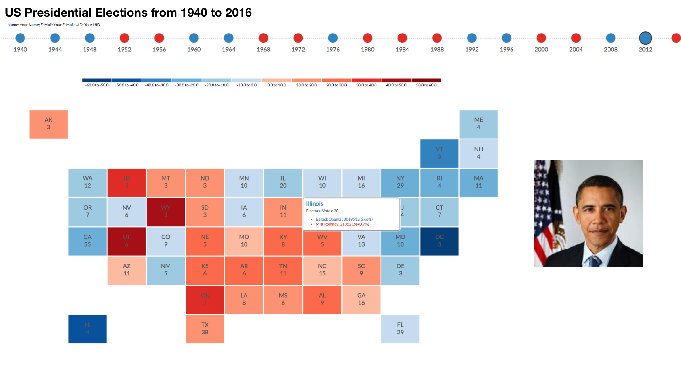
This is your first assignment in d3 and you will be learning the basics of d3 such as, loading and interacting with data. In this assignment, you will be using d3 to parse the US 2016 election dataset and create a visualization similar to the one above. The chart will show the election result by state and provides geospatial context. You will also implement a tooltip which provides details for a specific state on hover.
Dataset
2016 Election ResultsBasic Requirements
- Implement Cartogram
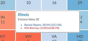
- Implement Hovering On hover, display a tool tip having information such as the state name, the number of electoral votes for the state, and also the name of the nominee, number of votes won and vote percentage for each party with respect to a given state, as shown in the screenshot below.
- Implement Color-coding
Implement a cartogram that communicates the winning percentage of the candidates, but also gives us some geospatial context. In the cartogram, each state is represented by a square of equal size; the squares are placed so that they correspond to their position on a map. By using equal-sized squares, we ensure that all state results are equally readable.
How do we lay these tiles out? Assume that you are given a matrix. where each cell corresponds to a tile. Some tiles are filled in (the states), others are not (i.e., remain white). Color-code the states either red or blue based on the winning party for that state, and display the abbreviation of the state and the number of its electoral votes.

Color-code the tiles by win percentage using an appropriate color scale. We will also create a legend associated with the chart, as shown in the screenshot below.

Extra Credit
- Implement Timeline
- Inlcude Images
Create a timeline that shows electoral results between 1940 and 2016 inclusively. The points on the timeline should be colored based on the winning party for that year. Should the user selected a point on the timeline, the cartogram should update, showing the eletoral results of the correstponding year. Notice in the example above, 2012 is selected and styled appropriately.
You may also add images for of the president for each year on the timeline
Submission
Submit your work via Blackboard by Tuesday March 7, 2017, 11:59pm (midnight). Use the naming convention: "FirstnameLastname_a4"(e.g., AlvittaOttley_a4).
Grading Criteria
- 5pts: When unzipped, project runs without errors or modifications on my part
- 30pts: Map displays data from file, states are acurately positioned
- 20pts: Hovering implemented
- 10pts: Created legend
- 15pts: States colored by percentage win
- *5 pts: Visualization posted online
- *30 pts: Timeline implemented and cartogram updates when dates on timeline are selected
- *10 pts: Image is added for each president
- *10 pts: Website available with your solutions for all 3 assignments
*Extra credit